Caryn Cziriak
Web Developer
If you are interested in working with me please contact me through my company, BuxMont Web LLC.
Keep on Cutting Hair Salon Website ~ Responsive Design
Website, responsive design | Keep on Cutting Hair Salon, January 2017 | HTML5, CSS3, Media queries, JavaScript, Photoshop www.keeponcutting.com
Objective
Keep on Cutting Hair Salon needed to establish a web presence so customers can find information about the salon online. The owner desired a simple brochure website to supply basic information and display customer endorsements. The target audience includes customers looking for local hair care and facial services in the Doylestown area, and current clients looking up contact information on the web. I provided a fully managed, custom design solution for her which includes domain registration, managed web hosting, and content update services.
Approach
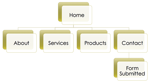
Keep on Cutting Site Diagram
I use a content-first design approach, which means I look at the purpose of a website and the information to be presented, and then base the site structure on that. First, I met with the owner to review what information she wanted to present online. The main purpose of the site is to provide visitors with information about the salon and the owner. This includes services offered with corresponding prices, products used and available for purchase at the salon, hours of operation, location and directions, and contact information. I created an outline of the content, and then the site diagram and wireframes using this information.
Keep on Cutting Site Diagram
We decided a on a responsive design since customers will often need to access the site from their phones for contact and location information. Providing a website that scales well across multiple device sizes has become increasingly important in recent years, since mobile device use for accessing the web is now surpassing laptop and desktop use.
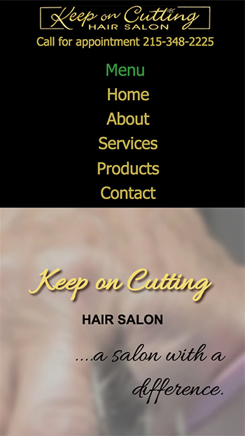
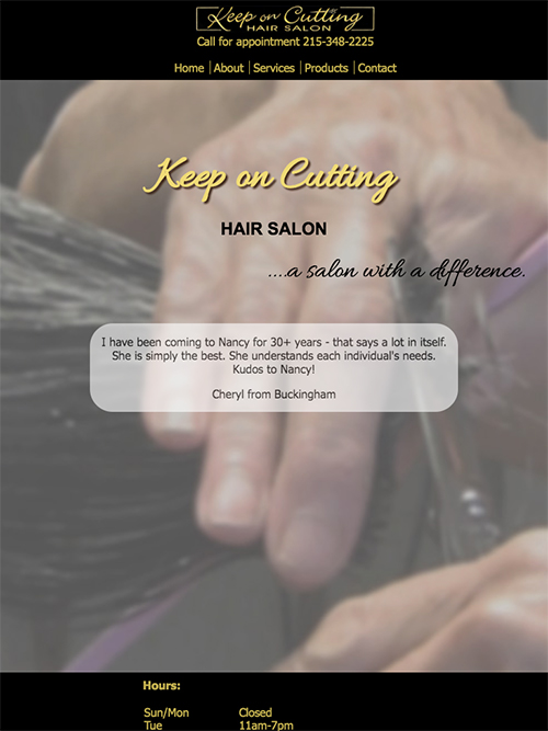
Since my client didn't have recent digital photos I took the photos used on the site myself. I also digitized the logo for the website from a photo I took of the sign outside the shop. The background image on the home page is a closeup of the owner's hands and scissors, cutting hair. This was chosen as representative of the business and business name.
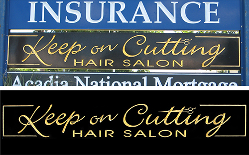
Digitized logo from photo of sign
General layout and design considerations:
Digitized logo from photo of sign
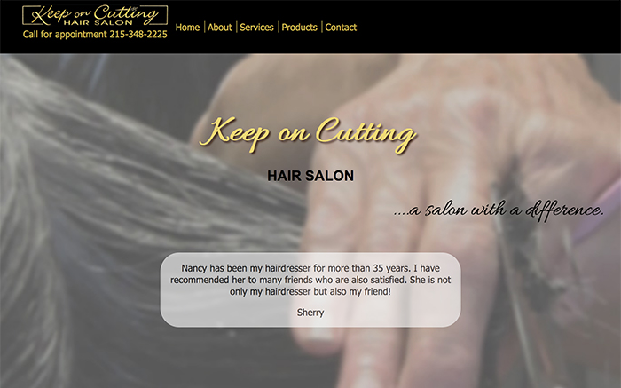
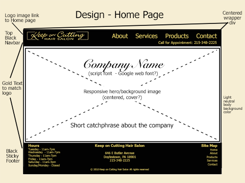
We decided to center the website design around photos of the salon and the owner at work. She wanted the website to convey that her salon has an important difference; that she provides very personalized service and also considers many of her customers friends. We went with a design that features a responsive full-width hero image on the home page as a background for the title, and smaller responsive full-width images for backgrounds of the headers on each page. The elements all stack vertically in mobile view, and some sections expand to 2 or 3 columns on wide screen devices. One of the requirements was for customer endorsements to be featured prominently, so I included these in a JavaScript text slideshow on the home page.
We made several modifications to my initial design mockup. We decided to make the site full-width instead of centered on a background at wider screen widths, and we removed the contact form since the business owner does all of her communication and appointment scheduling by phone or in person.
Along with contact information on the contact page I embedded a responsive Google map to aid clients in finding directions to the salon.
Keep on Cutting Wireframe - Home Page
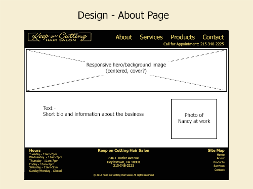
Keep on Cutting Wireframe - About Page
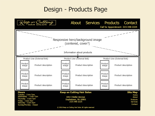
Keep on Cutting Wireframe - Products Page
Navigation:
I used a full-width drop-down menu in the mobile view, and a horizontal menu for wider screens. For medium width screens the horizontal menu links are stacked under the logo, and for larger screen widths they display side by side. There is also a site map included in the footer section with menu links.
Keep on Cutting - Mobile Drop-down Menu
Keep on Cutting - Tablet Horizontal Menu
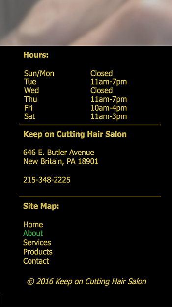
Keep on Cutting - Mobile Footer with Site Map
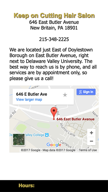
Keep on Cutting - Mobile Responsive Google Map
Color palette:
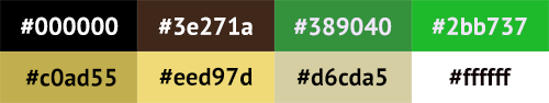
The chosen palette includes the black and gold from the logo, and incorporates the tan, brown and green colors of the salon decor. The colors were taken from the images of the salon and logo that are included in the site.
Typography:
For the decorative script used in the headings I chose the "Allura" Google web font. It was the closest match I could find to the script used in the logo on the sign. A blur filter was applied to the background images, and a drop shadow added to the text headers to make the text stand out from the background for better legibility.
The rest of the body uses the web-safe typefaces Tahoma, Arial, and generic sans-serif as the CSS font-family stack.