Caryn Cziriak
Web Developer
If you are interested in working with me please contact me through my company, BuxMont Web LLC.
Creative Communication Builders ~ Responsive Redesign Prototype
Website, responsive redesign prototype | Creative Communication Builders, April 2017 | HTML5, CSS3, Bootstrap, PHP, Photoshop View live demo online
Objective
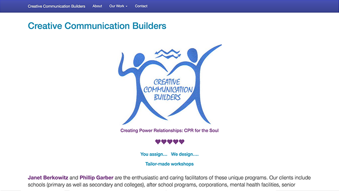
Creative Communication Builders contacted me requesting a redesign of their current website, which they had put together themselves a number of years ago on sites.google.com. They have an existing logo they plan to continue using, and requested colors similar to those used on their business card. I wanted to put together a quick prototype to use as a starting point to show different possibilities for our initial meeting. They have a lot of content on their current site, which I used for some of the placeholder content in the prototype.
Approach
I reviewed the content on their current website, reorganized it into major categories, and developed a site structure from there. I have found that Bootstrap, which I used for this project, is a great tool to use for creating a quick prototype. Bootstrap provides a customization page on their website where you can specify your chosen colors and many other customization settings, and then download a customized Bootstrap "build" for the project which includes those changes.
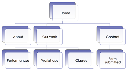
Creative Communication Builders Site Diagram
General layout and design considerations:
Since mobile device use is now surpassing desktop and laptop use, responsive design is more important than ever to ensure that a website will display well on all devices. For this reason, as on most projects I undertake, I took a mobile-first responsive design approach on this project. For large companies with an established non-mobile website, it might make sense to develop a separate mobile site, but for the majority of small businesses and organizations I believe a responsive design is a better approach.
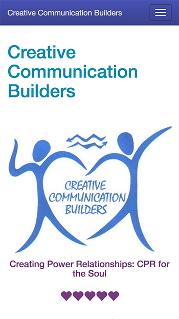
One of the client partners designed their logo which includes symbolism she feels is especially relevant to the work they do, so it is placed prominently in the heading section on each page. The primary brand color was selected based on the logo.
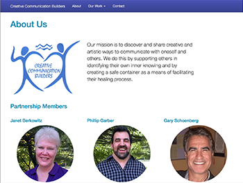
The content to be presented includes the standard "About" and "Contact" information and descriptions/examples of the work they do.
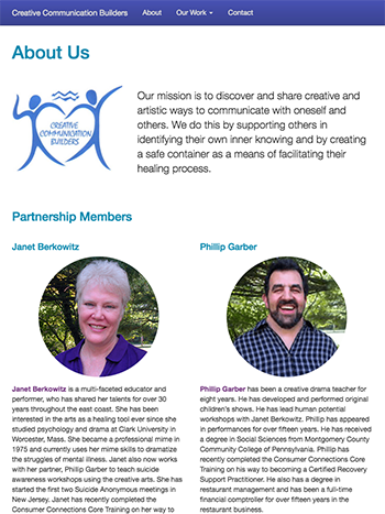
Creative Communication Builders - About page, wide screen
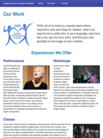
Creative Communication Builders - Our Work page, wide screen
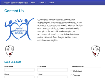
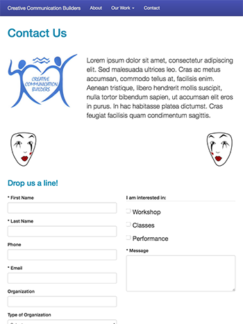
Creative Communication Builders - Contact page, wide screen
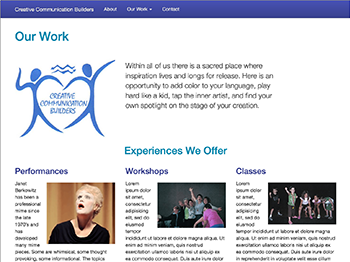
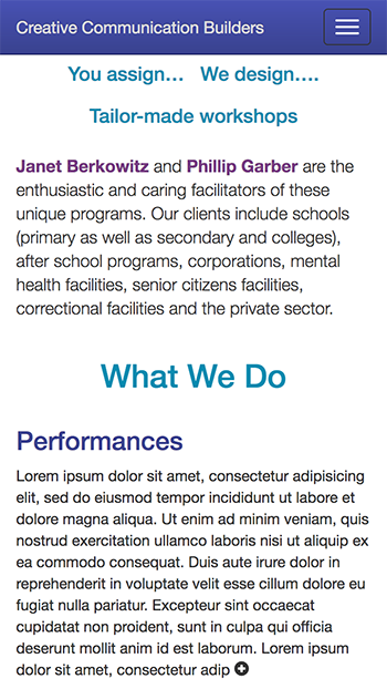
The type of work this client does includes three different modalities; performances, workshops and classes. These were each presented on a separate page, along with an overview page that summarizes each modality. This resulted in sections that had three types of information, so a 3-column layout was chosen for these sections on large screen devices. There are also three partners in the business, so a 3-column section was also used on the "About" page. At medium screen widths the third column spans two columns below the first two wherever possible to avoid unbalanced white space.
Creative Communication Builders - About page, medium screen
Creative Communication Builders - Our Work page, medium screen
Creative Communication Builders - Contact page, medium screen
Some of the other requirements for the site included displaying a client list and endorsements, and the need to have video of performances and workshops embedded in the site. The endorsements are included under the main content on the home page, and the client list is shown on the "About" page. The performance and workshop videos are included with summaries on the page for each category.
I found that I also needed a divider for major sections on the same page. I drew a sketch of a mime face based on a photo from the company brochure, which was included as mirror images on opposite sides of the screen as a divider.
Creative Communication Builders - Home page heading, small screen
Creative Communication Builders - Home page description, small screen
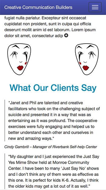
Creative Communication Builders - Home page endorsements, small screen
Navigation:
I used a top navbar with a full-width drop-down menu for the mobile view, and a horizontal menu for wider screens. On both mobile and wide screen views, the link for "Our Work" includes a drop-down submenu with links to the summary and individual pages for the different types of work they do. The navigation bar sticks to the top of the viewport at all screen widths so it's always accessible.
Color palette:
Bootstrap calculates and adjusts color values for various elements based on several "brand" and "state" colors, making them lighter or darker where appropriate for contrast. It darkens the base primary brand color chosen, so that has to be taken into account when selecting the palette colors. There are default values for colors in the Bootstrap CSS files, which I changed with a customized build to closely match the colors used in the client's business card. I also customized the default text and background colors for the success, information, warning and error states. Bootstrap applies gradient and transparency effects to these.
Typography:
Since this is a quick prototype being used as a starting point to review with the client, I left the default Bootstrap font-family stack (Helvetica Neue, Helvetica, Arial, sans-serif) in place for now. This will be overridden when the desired typefaces are selected with the clients' input.
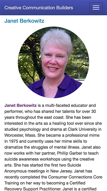
Creative Communication Builders - About page, partner profile, small screen
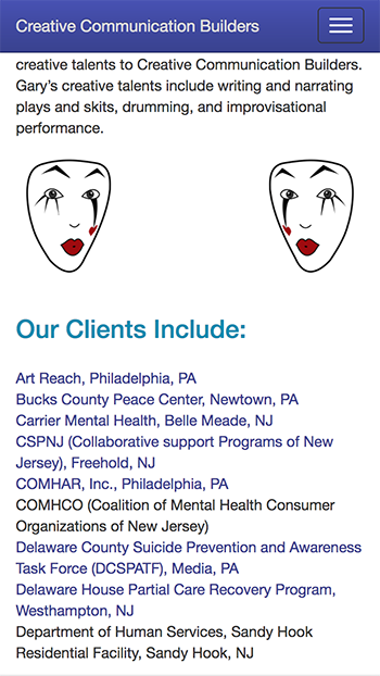
Creative Communication Builders - About page, clients, small screen
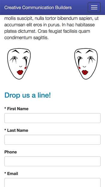
Creative Communication Builders - Contact page form (top), small screen
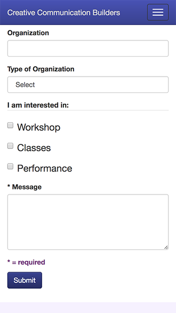
Creative Communication Builders - Contact page form (bottom), small screen